Through composition, architects combine mass and space to create an organized expression. This ordering procedure is fundamental to determining the personality, appearance, and style of a design.
The link between the structural parts and hostile or surrounding regions makes composition essential in architecture for the best images of a building or place.
Color:
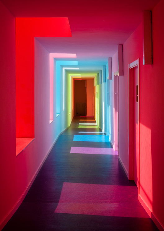
The use of color in architecture can affect the viewer’s emotions. Consider how you may feel if you walked into a room that was crimson or saw a structure with a variety of colored siding. You may also think about how color is utilized to complement or contrast with the surrounds of a building.
Scale:
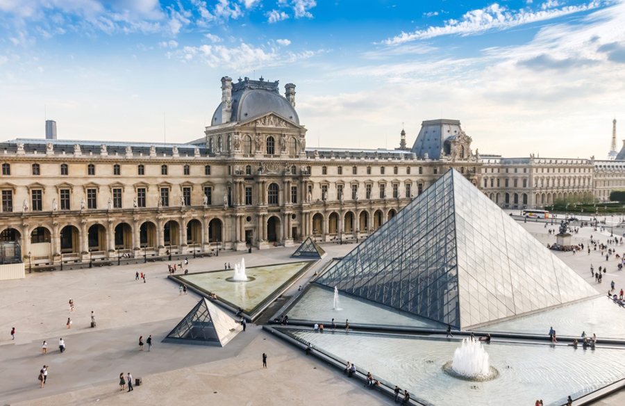
Scale describes how several elements’ sizes compare to one another. The viewer’s personal dimensions can influence how they perceive scale. Therefore, the scale of the building a spectator is viewing depends on their physical characteristics.
Contrast:
The difference between things in a composition is called contrast, and it typically comes in the form of different sizes, textures, colors, positions, shapes, and orientations. This idea can give two- or three-dimensional compositions a sense of depth.
Unity:
It is when harmony among the different design elements is achieved. More than that, it is the final result of each object and design principle working together to improve the appearance of a space.
Light:
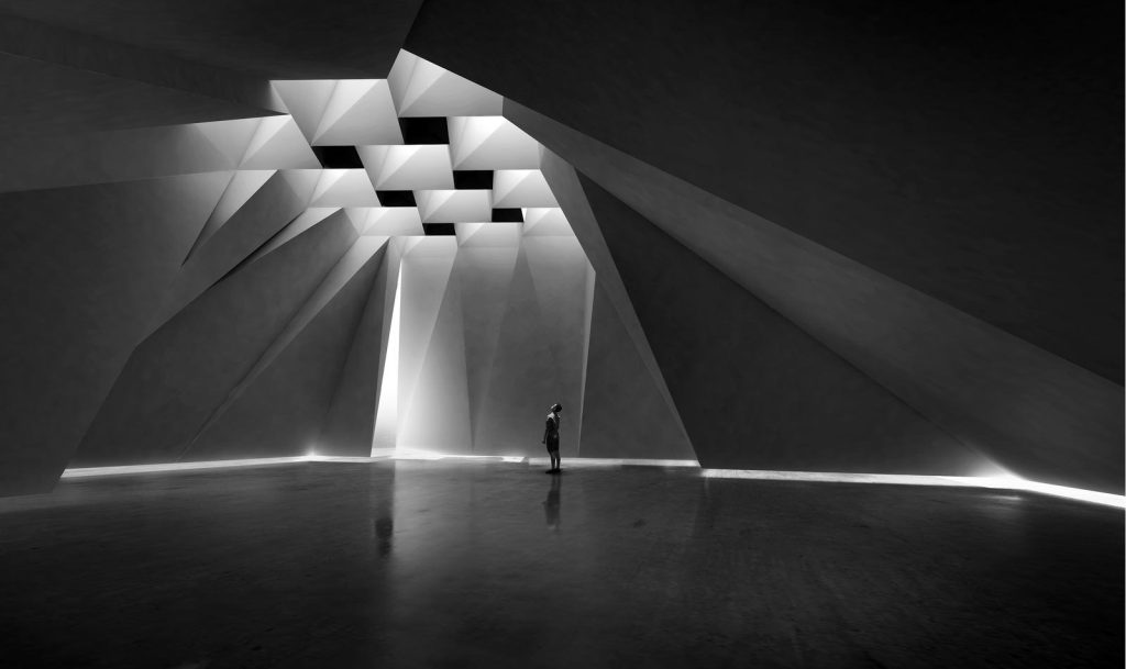
Light attracts attention to textures, colors, and space shapes whether it comes from daylighting or artificial lighting, assisting architecture in fulfilling its actual function. The most important sense for us to enjoy architecture is vision, and lighting makes it even more appealing to the eye.
Balance:
One definition of balance is the idea of visual equilibrium. Opposing forces within a composition produce visual stability in a manner similar to our feeling of balance in physical situations, such as while attempting to stand on a ball.
- If the elements are equal and symmetrical, we speak about static equilibrium.
- If they are compensated by the geometric difference or color…, we speak about a dynamic equilibrium.
Texture:
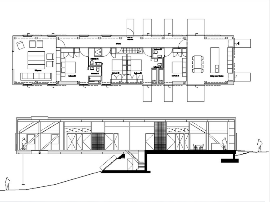
The surface characteristic of an object is its texture. For instance, does it appear smooth and polished or rough and coarse? Tactile or haptic refers to actual surface texture, whereas visual or optical describes texture that you can see but not touch. For instance, patterns can be used to generate visual texture. A wooden door handle or a metal stair railing, for example, can express the tactile surface.

Proportion:
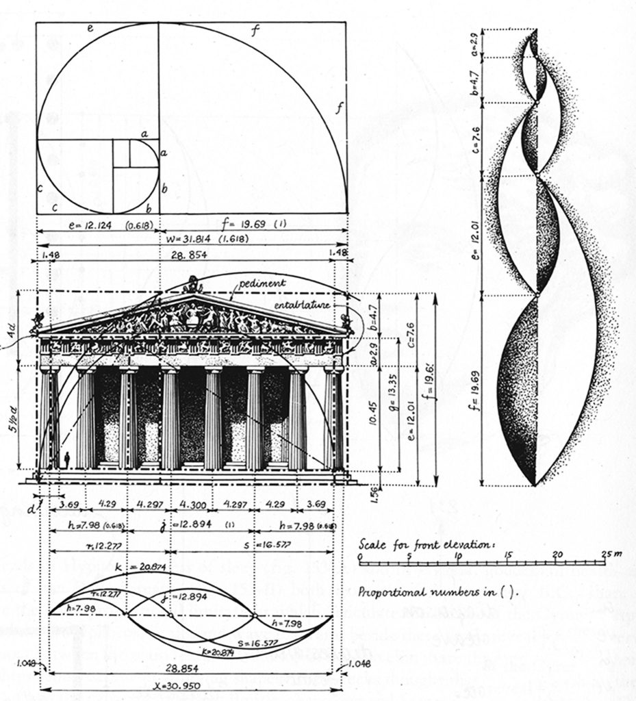
In architecture, scale and proportion are important concepts. The correct and pleasing relationship between one element and another or the whole is referred to as proportion. In contrast, scale refers to the size of something in relation to another object’s size or to a reference standard (like a human being).
Centrality:
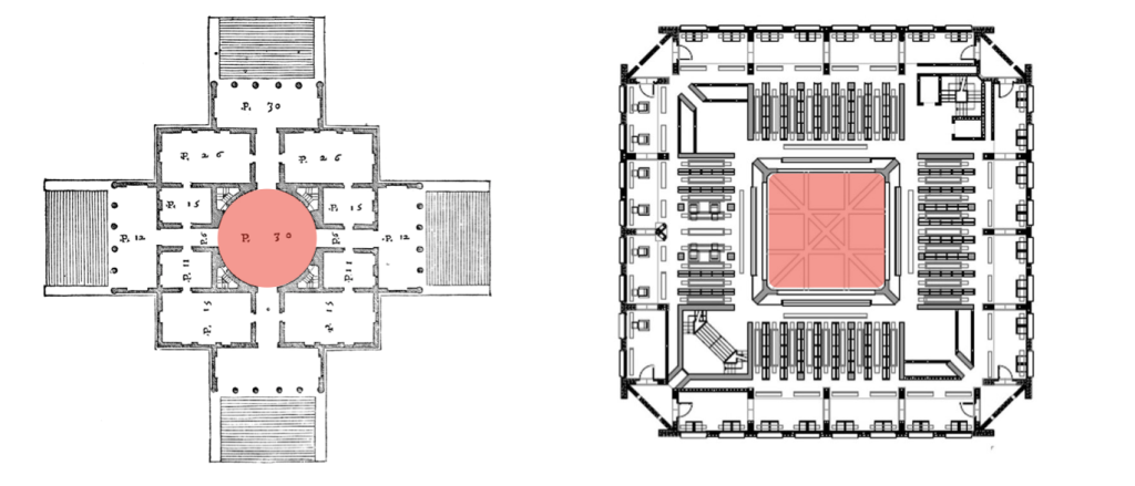
Centrality describes the action of a central element in its periphery. It was defined thus as a hierarchical concept between service and attraction by W.E. Christaller back in 1933. The attractiveness and circulation of this element are based on the efficacy of the central pole and its accessibility.
Limits:
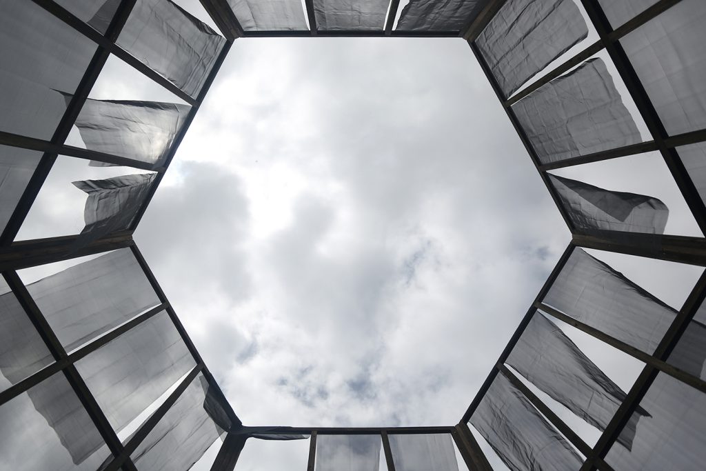
It is the edge of the elements of a composition where there is a change from the rest.
Functionalism:
According to the functionalism theory of architecture, a building’s design should be solely driven by its function and objectives.
There are three types of functionalism, according to Peter Collins:
- Mechanical Functionalism:
It has its roots in the Industrial Revolution.
The form is a direct and automatic consequence of the functions to which it is linked.
Beauty comes automatically from perfect mechanical efficiency and not from a deliberate search for beauty.
- Organic Functionalism:
The form takes on a biological sense and adapts to the living functions that must be carried out in the environment (architecture), tailored to human activities and the social environment.
- Moralistic Functionalism:
Forms must be precisely what they appear to be. The era and purpose of a building should be correctly reflected in it. It’s crucial to use structural elements and systems in a morally and honestly manner. The moral connection also implies that usefulness is a virtue in architecture and that decorative forms that serve no purpose should be avoided.